

Last Diwali, Karthik Subramanian from Coimbatore spent a weekend perfecting his steel lunch box listing, and on his laptop it looked sharp. Then his sister opened it on her phone and asked one question: “Which one is the leak-proof one?” The answer sat in bullet three and inside the A+ module, and neither was on her screen. She saw a square photo, half a title, a price and a yellow button.
That gap between the page you build and the page your buyer sees is where many Indian listings quietly lose sales. This guide builds a mobile-first Amazon listing screen by screen: what shows before the first scroll, what Amazon’s new 75-character title rule changes, where bullets and A+ actually land, and a 20-minute audit you can run on your own phone today.
Why a Mobile-First Amazon Listing Matters in India
The numbers behind the thumb-scroll shopper
India never went through a desktop phase the way the US did. For most first-time buyers, the phone was the first and only computer they owned. Grips Intelligence data on Indian ecommerce websites from March 2025 to January 2026 puts mobile at roughly 94% of sessions, with desktop near 5%. That counts browser visits only; Amazon app traffic, which is mobile by definition, comes on top.
The buyers have shifted too. Redseer estimated that about two-thirds of shoppers in the first two days of this year’s festive sales came from Tier 2 cities and rural India, and back in 2022 Amazon said more than 90% of its customers came from Tier 2 and smaller towns. Many of them browse in Hindi, Tamil or another Indian language on mid-range Android phones.
Why your laptop preview is lying to you
On a laptop you see the title, images and bullets side by side. A phone stacks the same content in one column, so every element competes for one narrow strip of glass. Neha Gupta from Jaipur, who sells cotton bedsheets, found that her Business Reports showed nearly four in five sessions coming from the mobile app. Yet her listing had been written and approved entirely on a 15-inch screen. Once she started reviewing it on her phone first, the fixes were obvious within minutes. That habit is the heart of Amazon listing optimization for mobile.

What Shows Above the Fold on a 6-Inch Screen
The search results card
Before anyone sees your product page, they see a card in search results. On a phone that card is mostly your main image, a few lines of title, the star rating, the price, any coupon or deal badge, and the delivery promise. Sponsored placements sit in the same grid, so you compete at thumbnail size against eight or ten similar products per scroll. Your bullets, A+ and brand story do no work at all until someone taps.
The product page before the first scroll
After the tap, the image carousel takes up almost the full width of the screen. Around it sit the brand line, title, rating, price, and usually the delivery date with the Add to Cart and Buy Now buttons, though the exact order shifts by category and app version because Amazon tests layouts constantly. In practice, the decision to stay or go back rests on five elements:
- The main image and the first two or three images in the swipe.
- The title, now capped at 75 characters in most categories.
- The star rating and the number of ratings beside it.
- The price, the discount and any coupon line.
- The delivery date and the Prime badge.
If one of those five is weak, the shopper rarely scrolls far enough to read your bullets.
Mobile Titles After Amazon’s 75-Character Rule
What changed on 27 July 2026
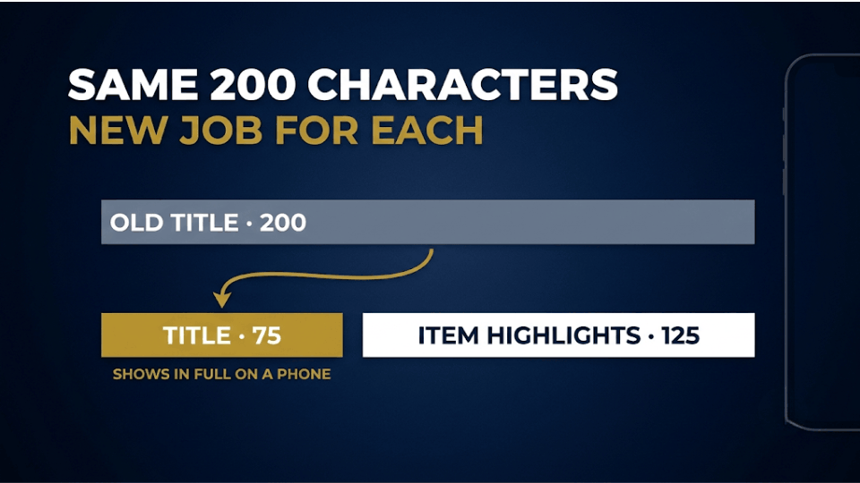
For years, sellers packed 150 to 200 characters into titles while phones showed only the first 70 or 80. Amazon has now closed that gap. In a Seller Central India announcement it set a 75-character cap, spaces included, for titles in every category except media from 27 July 2026, and named mobile display as the reason. Titles still over the limit are being replaced gradually with Amazon’s AI-written version, and brand owners get 14 days to review those changes. If you haven’t checked your catalogue since July, some titles may already read differently from what you wrote.
Writing a title a phone can show in full
Seventy-five characters is about ten words, so every word has to earn its place. Here is a formula you can copy for every ASIN: Brand + Product type + Key feature + Size or count. Use the words shoppers actually search, drop filler like “premium quality”, and never repeat the product type. For Karthik, “Vetri Steel Lunch Box, 3 Tier, Leak-Proof, 1.2 L” comes to 48 characters and answers his sister’s question before she scrolls.
Item Highlights: your second line on mobile
Amazon paired the shorter title with a new field called Item Highlights. It holds 125 more searchable characters and appears just below the title in search results and on the product page. Sellers report that it only unlocks once the title is within 75 characters. Use it for material, use case, compatibility or the doubt buyers raise most. Deepa Nair from Kochi moved “BPA-free, microwave-safe, fits school bags” into Item Highlights, and her search click-through rate rose from 0.31% to 0.42% the following month.
Before you rewrite anything, keep the 20-minute audit at the end of this post open in another tab. It turns everything here into a checklist you can tick through one product at a time.
Main Images That Sell at Thumbnail Size
Your first image now does the title’s old job
On a phone, the main image is the largest thing on screen in both search and the product page. It has to identify the product instantly at postage-stamp size, then reward the tap with clear detail. Fill around 85% of the frame, keep the pure white background Amazon requires, and choose the angle that shows what buyers compare on, such as the lid seal on a lunch box. Upload at least 1,000 pixels on the longest side so zoom works; 1,600 or more gives room for pinch-to-zoom. Our guide to main image tweaks that lift click-through rate goes deeper on angles and testing.
Infographic images built for a small screen
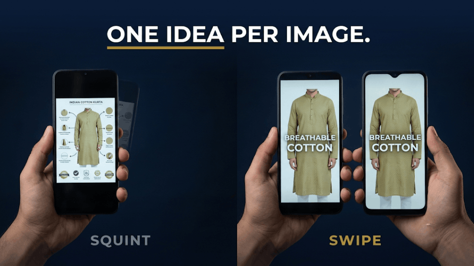
Your secondary images are the real mobile bullet points, because they get swiped before anything gets scrolled. Many sellers design infographics on a monitor with six callouts in small text, which become unreadable smudges on a phone. Limit each image to one idea, two or three words of large text and one strong visual. Imran Sheikh from Lucknow, who sells chikankari kurtas, rebuilt his seven images this way: one each for fabric, fit, size chart, wash care and occasion. His unit session percentage moved from 9% to just over 12% in six weeks with no change in price.
Bullets, A+ and Video Below the First Scroll
How much of your bullets a phone shopper reads
On mobile, bullets sit under an “About this item” heading below the buying area, and the app usually shows only the opening lines before a “See more” tap. Some guides put the cut at about three bullets, though it varies by app version and category. Either way, the first 200 characters of bullet one carry far more weight than bullet five. Open each bullet with a short capitalised benefit and move warranty details higher than feels natural. Our guide on writing bullet points that convert browsers into buyers covers the copy side.
Making A+ Content readable on mobile
A+ Content does render on phones, as a stack of images scrolled one module at a time, and its position has shifted more than once as Amazon tests layouts. What doesn’t change is that it sits several thumb-swipes below the first screen, so it serves a shopper who is already interested. Design every module phone-first: large type, one message per module, no fine print baked into images. Video often appears inside the image carousel, the one rich-media slot met before scrolling, so a short captioned clip of the product in hand can beat a sixth A+ module. Our guide to using A+ Content to build trust shows which modules hold up.
Price, Delivery and Trust Signals on Mobile
The buy area is now part of the story
On desktop, the buy box is a column on the right. On a phone, the price, delivery date, stock status and buttons sit in the main scroll right under your images, so they read as part of the product story. A struck-through MRP, a coupon checkbox and a clear delivery date often tip a hesitant buyer. If FBA lets you promise next-day or two-day delivery to Tier 2 PIN codes, that promise is a selling point above the fold. A slow or vague delivery date is just as visible.
Reviews and Q&A as mobile research
Phone shoppers rarely read every bullet, but they do jump to the rating, review photos and questions. Rohit Verma from Indore noticed buyers repeatedly asking whether his phone stand could hold a tablet, an answer buried in bullet four. He added it to Item Highlights and his second image, and posted a clear reply under the existing question. Returns marked “not compatible” fell by about a third the next quarter. Our post on the customer Q&A section explains how to keep those answers working.
Want a simple swipe file? Screenshot your best competitor’s first mobile screen next to yours and save both in one folder per ASIN. That pair becomes your reference for every rewrite.
A 20-Minute Mobile-First Amazon Listing Audit
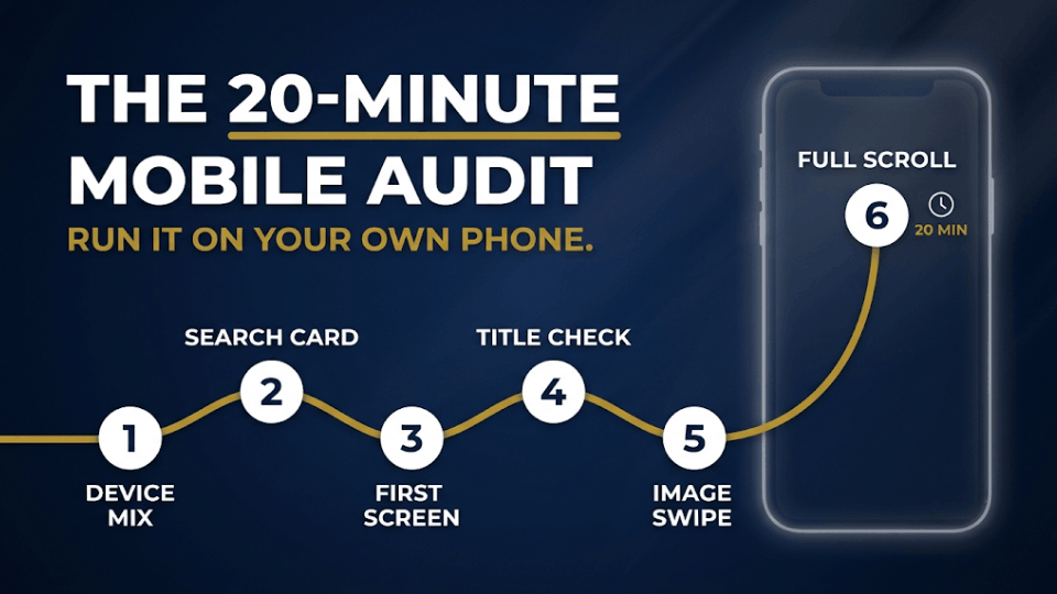
You need only your phone, Seller Central and about twenty minutes per hero ASIN. Work through these steps in order:
- Check your device mix in Business Reports by opening Detail Page Sales and Traffic by Child Item and comparing mobile app sessions with browser sessions. Our post on free Seller Central reports shows where to find them.
- Search your main keyword in the Amazon app the way a buyer would, then screenshot your results card beside your top three competitors.
- Open your listing and screenshot the first screen before any scroll. If brand, product type and your key differentiator aren’t all visible, rewrite the title or the first image.
- Confirm the title is within 75 characters and still says what you wrote, then fill Item Highlights with the details that dropped out.
- Swipe through your images at a normal reading distance. Any text you have to squint at needs to go.
- Scroll to the bottom and note where bullets, A+ and video land, and whether the opening line of bullet one would convince you on its own.
Repeat the audit after major app updates and before big events such as the Republic Day sale. Swati Kulkarni from Pune runs it every quarter on her ten best sellers and keeps each screenshot set as a before-and-after record for her team.
Frequently Asked Questions
How many characters of an Amazon title show on mobile?
Phones used to cut titles after about 70 to 80 characters. Since 27 July 2026, titles in most categories are capped at 75 characters including spaces, so the full title can display on a phone. Tight search grids can still wrap or clip it, so put brand, product type and your main differentiator first.
Does the 75-character title limit apply to Amazon India?
Yes. It was announced to Indian sellers through Seller Central India and covers every category except media. Titles still over the limit are being rewritten gradually by Amazon’s AI, and brand owners get 14 days to review those suggestions. You can edit your title and Item Highlights at any time, as long as they stay within the limits.
What are Item Highlights on Amazon?
Item Highlights is a 125-character searchable field shown just below your title in search results and on the product page. Use it for materials, use cases, compatibility and details that no longer fit a 75-character title. Sellers report it only becomes editable once the title is within the new limit, so fix the title first.
Does A+ Content show on the Amazon mobile app?
Yes. A+ Content appears in the app as modules stacked one below another, several scrolls beneath the first screen, and its position relative to the bullets varies as Amazon tests layouts. Design every module for a narrow screen: large text, one message per module and no fine print inside images.
How do I check how my Amazon listing looks on mobile?
Open the listing in the Amazon app on your own phone and screenshot the first screen before scrolling. Check on a budget Android phone too, since many buyers use one. In Business Reports, compare mobile app sessions with browser sessions to see how much of your traffic gets the phone layout.
How many bullets show on mobile without tapping?
Usually only the opening lines of “About this item” show before a “See more” tap, often around the first three bullets, though it varies by category and app version. Treat the first 200 characters of bullet one as the only text every shopper is sure to read, and lead with your biggest benefit.
How often should I audit my listing for mobile?
Check your best sellers on mobile every quarter, and again after any major app update, policy change or AI title rewrite. Do one more pass three to four weeks before big sale events, and keep dated screenshots so you can see what helped.
Conclusion
Your listing is judged on a phone long before anyone reads it in full. The image, the 75-character title, the line of Item Highlights beneath it, the price and the delivery date decide whether a shopper stays; everything below the first scroll only helps once you’ve earned that attention. Start this week with your top three ASINs: screenshot them, run the six-step audit, and fix whatever your first screen fails to say.
If you’d like to build listings, images and ads that work together as one system, our 3-Day Amazon Business Training walks you through it step by step with live examples from Indian sellers. Your buyers already have their phones in hand. Make sure the first screen tells them everything they need.
